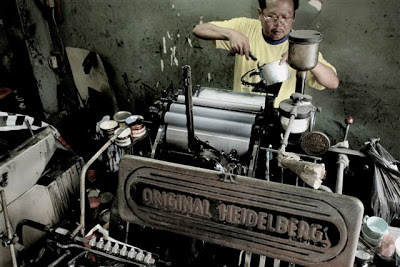
It is an article about our letterpress printing from one of our best client. She had a hard time to find a letterpress printing press in Bangkok, until she found Press A Card. Thank you for choosing us to be a part of your happy memory.
This is the link to the article.
http://whydoyounot.blogspot.com/2010/09/choose-handmade-wedding-stationery-with.html********************
นี่เป็นบทความเกี่ยวกับการพิมพ์เลตเตอร์เพรสส์ ซึ่งเขียนขึ้นโดยลูกค้าผู้น่ารักของเรา เธอใช้ความพยายามอย่างมากในการค้นหาร้านที่ใช้ระบบการพิมพ์เลตเตอร์เพรสส์ในกรุงเทพ จนกระทั่งได้มาพบกับ “เปิ๊ดสะการ์ด” ของเรา ขอบคุณที่ทำให้เรามีส่วนช่วยเติมเต็มความสุขและความทรงจำให้เธอ
คลิกเพื่ออ่านบทความตามลิ้งก์ด้านล่าง
http://whydoyounot.blogspot.com/2010/09/choose-handmade-wedding-stationery-with.html********************
Choose handmade wedding stationery with a vintage flair…
Invites for LOVEFEST have been sent out. You girls in Singapore might have received it already and all you overseas babes will get it in a few days, I’m sure! I am not putting photos of it on the blog but instead I have decided to share “the-making-of-the-letterpress-invitation”.
Letterpress combines my love of all things vintage and my obsession for beautiful design and typography. I love the history of and imperfections of old things and the detail and time taken to make common, usually unimpressive things visually rich.
As a printing technique, letterpress is a form of relief printing where the raised surface of text and images is inked and then pushed onto the paper. The resulting print can leave a deep impression, easily felt and seen on soft paper. Such relief effects were not traditionally desired by commercial and trade printers. But to me, and many DIY and indie-crafter circles, it is this very character and charm of craft letterpress that makes it undeniably chic.
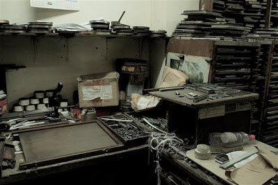
With some luck and my almost-advanced Google skills, I arrived at this hidden gem of an old printing shop. Y and I walked in and the atmosphere was magical. I immediately felt part of a royal history that this old printing process has – the antique machines were on individually fed and the prints were incredibly prepared and finished lovingly. Paint pots were strewn on the floor and one could no longer tell what colour the original floors were. I knew in half a heartbeat that this is the perfect place to print the wedding stationery (actually, to print anything!)
A second visit was to check the colour and the final artwork. No squinting in front of the computer deciphering Pantone colours, mind you. If was like art school again, paints and pots and mixing galore! And after we found the perfect warm dove grey, the paint was fed into the machine and the machine began taking on a life of its on, animatedly and wonderfully boisterously dishing out the prints.
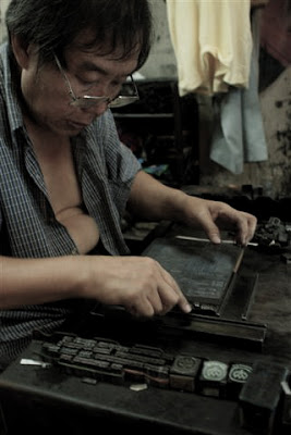
This is where it starts. The letters in lead – where each lead stump is a single alphabet. The shop-owner, Zoom, in his charming humour explained which lead stumps and strips are the modern day Microsoft formatting equivalents, i.e. Kerning, paragraph indents, double lined spacings and so on.
This is how it is done! The master-typesetter, patiently, passionately, a piece at a time.
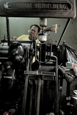
The man and his machine – the trusty ‘Original Heidelberg’. This was imported from the States about 2 generations ago.
The master-letterpress crafter mixing the perfect warm dove grey ink for my wedding invite. We got it at the sixth attempt after some experiment of some Pinks that resemble old Barbie dolls’ dresses, Beiges and some Almost-Blacks.
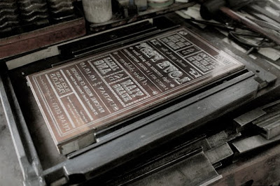
The actual block used to print the invites. For the design, we said yes to vintage, eclectic, chic fonts and a carnival theme. And no to anything cute, sweet or just screams bridal.
Looking forward to hear from you when you get the invite. And do enjoy the little whiff of antique ink and glorious printing imperfection in your hand!
